Showing posts with label Forgotten Artist File. Show all posts

Monday, July 15, 2013

The Forgotten Artist File: Chryssa

Discovering Chryssa

 Art museums can be big places, and their permanent collections can be even bigger.  Few museums can exhibit all the work they own at the same time, so this invariably leads to some or most of the permanent collection relegated to storerooms.  In addition to space limitations, most museums have “stars” among the collection that are always on display, leaving less display space for lesser-known works in the collection.  For example, it’s hard to imagine the Museum of Modern Art without Picasso’s Desmoiselles d’Avignon or Dali’s Persistence of Memory.  Those works are always on display (in many cases hung on the same wall in the same space for decades), and certainly there’s merit in this practice.  They are important works by important artists and they also bring people through the doors, so it functions both culturally and economically.
But, searching through a museums “back catalog” can be a fascinating exploration of old art movements and collecting trends.  Artists who were intensely popular for a short time may be represented in the collections of many museums, but the work may later be forgotten or become a footnote to art history, and can go unseen for years.  Sometimes, there just isn’t enough room to show it all.  The Albright-Knox Art Gallery in Buffalo is a perfect example of this.  It’s also my home-town museum, and I know the collection well.  By searching through the permanent collection, one can see trends in collecting as well as clues to the financial situation of the institution.  The Albright-Knox benefited from the philanthropy of Seymour Knox, who donated hundreds of works of art to the museum in the 50s, 60s, and 70s.  Knox liked Absrtract-Expressionism, so he bought and donated major masterpieces from this era to the Knox, helping the museum amass one of the finest Abstract-Expressionist collections in the U.S.  After Knox died, however, collecting slowed somewhat and the Knox had a smaller budget to collect work.  Superstar artists of the 80s like David Salle and Eric Fischl, who saw their prices skyrocket when they were very young, are absent from the Knox’s collection to this day.  One artist who is well represented in the collection of the Knox, but who isn’t shown much these days, is the subject of this week’s post: the Greek artist known as Chryssa.
Study for the Gates, No.2, 1966

I first discovered the work of Chryssa (full name: Chryssa Vardea-Mavromichali) when I was in college.  My university had an excellent library devoted to art books, and I discovered a number of books that listed works that were in the collection of the Albright-Knox.  Most museums allow you to search their collections on-line today, but back in the day old books were all I had.  These books let me precariously explore the storerooms of the Albright-Knox.  Through listings of artists names and photos (some black and white, some color) I was able to experience and appreciate the rich and varied collection that can only be shown in pieces at the actual brick and mortar museum.  I discovered the artist Chryssa there in those pages, and was surprised to see that the Knox owned quite a few works by her (their website currently lists 57 works total, but many of those are taken from a portfolio of prints). 
Automat, 1971

Chryssa is a painter and sculptor, but is most known as an innovator in the field of neon art.  Although neon signs were commonplace by the 50s and 60s, the art world at the time was a pretty staid place mostly composed of oil paintings and sculptures made from traditional materials (marble, bronze, etc.)  In the 1960s, experimentation with industrial materials started to creep into the art world, and must have seemed quite subversive at the time.  Something like neon certainly isn’t precious (like marble) and isn’t particularly expensive.  The use of imagery and materials taken from people's everyday lives grew into a larger movement (pop art is probably the most well-known example of this).  Chryssa was on the vanguard of this new trend, using a material traditionally relegated to signs (something utilitarian) to create art (something purely visual).  Her work definitely played off of the idea of neon as signage.  Her pieces often used letters or fragments of letters, sometimes exaggerated of distorted so as to become unrecognizable.  Letter fragments were also sometimes layered over each other, becoming purely aesthetic as they lost their functions as letters.  They also sometimes appear taken from foreign languages, visible somehow as letters but unreadable nonetheless.

The Gates to Times Square


One of the many studies created for the piece

While researching Chryssa, I learned that the work she is most identified with, and the work that is considered her most important, is a monumental sculpture called The Gates to Times Square (1964-66). The Gates piece was made during one of Chryssa’s most productive periods, a time that saw her exhibit in prominent museums such as the Whitney in New York.  She also contributed to several well-known group exhibitions, including the Sao Paolo Biennial and Documenta in Kassel, Switzerland.  It was made during a period where she was working more with neon as a material (she had previously created paintings and wood sculptures).  Neon would become her defining medium, and while working on the Gates she perfected her craft by creating numerous stand-alone sculptures along with multiple studies of the Gates elements.  When completed after two years of work, The Gates to Times Square stood 10 feet tall and was just as wide, and contained neon elements along with steel and plexiglass parts.  


Chryssa searching through sign parts in Brooklyn


The Gates to Times Square is Chryssa’s homage to America.  She is quoted as saying “America is very stimulating, intoxicating for me.  Believe me when I say there is wisdom, indeed, in the flashing lights of Times Square.  The vulgarity of America as seen in the lights of Times Square is poetic, extremely poetic.  A foreigner can observe this, describe this.  Americans feel it.”

The artist working on the piece in her Brooklyn Studio

The Gates, with some of it's neon lit
While researching this piece, I was quite surprised to find that it is currently a part of the permanent collection of the Albright-Knox.  I’m a little sad to say that in my many years of visiting the Knox I have never seen it on display.  It’s big (10 X 10 X 10’) and I think that is one of the main reasons they don’t display it very often, but it also contains technological elements that pose other problems.  Artworks that contain electrical elements and lighting, as the Gates does, are subject to breakdown, blown lights, etc.  What happens if one of the specially made neon pieces in the Gates stops working?  Replacement can be costly.  In the future, as technology changes and becomes obsolete, replacement may not be possible.  Curating mid to late 20th century art that contains non-traditional materials creates a whole museum-full of issues.  It’s unfortunate that in order to preserve these works, it means they aren’t seen as often.  I hope to see The Gates to Times Square in person someday, and hope that the Albright-Knox dusts it off and displays it once more (even temporarily) for a new generation to see.  Until then, there are some photos of the piece, although I admit it was hard to find color pictures of the sculpture.  Some are included here.  I know I have a book somewhere that has a good color photo of the work in it.  If I can track it down, I’ll post it here.

When completed, the work was temporarily exhibited in Grand Central Terminal
 Next time, I'll highlight a new artist.  It might be someone you've never heard of.


Thursday, June 6, 2013

The Forgotten Artist File: Peter Blume


I certainly remember the firt time I saw Peter Blume’s art.  It was as a young boy, playing the board game called Masterpiece.  Masterpiece was produced by Parker Brothers, and the version my parents had was made in 1970 (click here to watch a great old-timey commercial)  To play, the players move around the board and buy paintings for sale or at auctions.  There are 24 works of art reproduced on cards.  The paintings in the game are all taken from the collection of the Art Institute of Chicago.  Playing Masterpiece as a kid was a big deal because it was more of an “adult” game.  It deals with things like money and budgeting, and there is also a fair amount of bluffing required, since the paintings have secret values only the owner is aware of, and some of the works are worthless forgeries.  In my childhood home, it was also one of my parent’s games, and allowing my siblings and I to play it required a certain amount of trust on their part, since we lost a lot of playing pieces from other games they had.  My parents version of Masterpiece remains intact to this day and it is still played regularly by my family.  When I get together with my siblings, Masterpiece invariably comes out, and I also was able to introduce my wife (also an artist) to the game when we started dating.
Peter Blume, The Rock, 1948
But enough about my childhood remembrances of an old board game.  One of the “paintings” you could buy and sell in Masterpiece was an extremely odd picture called The Rock, painted by Peter Blume in 1948.  As a child, I obviously didn’t know anything about Blume, or the other more well-known artists represented in the game, such as Jackson Pollock or Marc Chagall, but I always remembered this weird painting.  It depicts a strange landscape, destroyed on the right and being built up on the left.   In the center is the titular object.  A large, broken rock sits on a raised piece of earth, and a desolate landscape is visible behind its platform.  Animal bones lie at the base of the rock, but life springs from the base as well.  A woman below seems to be pulling at the very ground that is supporting it.  When I saw the painting in person for the first time in 2001 while on a business trip to Chicago, I noticed details I had never seen before, like the Coca-Cola sign on the ground at the bottom right.  It is a strange, surreal picture that doesn’t offer a straightforward narrative.  I really didn’t know that much about Blume besides this painting and a few others, so I decided to research him a little more for this blog.  He has a decent representation on the Internet, but in choosing images I tried to pick some that I hadn’t seen before.  Even though some of his work is visible online, he's an example of a once well-known artist who has since faded into obscurity.  His work definitly deserves a look.


Blume, Cyclamen, 1925

Blume was born in Russia in 1906 but his family immigrated to the US when he was still very young.  Settling in New York City, Blume was interested in art at a young age and started taking classes when he was 17.  At the time Blume started honing his artistic style, New York City was in an interesting place art-wise.  Realism was still dominant, but abstraction (introduced to New York at the famous Armory Show of 1913) was also making its mark.  Blume, along with artists like Charles Sheeler, Charles Demuth, and Charles Burchfield, had a toe in both worlds.  A strong base of realism in these artists was tempered by a flair for the abstract.  Blume was especially influenced by Cubism in his early career, as evidenced by this early painting.  He showed at the same gallery in New York with Sheeler and Demuth, and it’s interesting to see that they were all working through similar ideas, much like Picasso and Georges Braque had done when they were developing Cubism.

Blume gained a great deal of notoriety during his career and was collected by top museums such as the Metropolitan Museum, the Museum of Modern Art, the Whitney Museum of Modern Art, and the aforementioned Art Institute of Chicago.  He also had several well-known collectors interested in his art.  Edgar Kaufmann, founder of Kaufmann’s Department store, owned several Blumes and his son donated The Rock to the Art Institute.  He also commissioned him to paint this picture of his house in the Pennsylvania countryside that some people might have seen before:

It's Fallingwater by Frank Lloyd Wright, in case you haven't guessed.

Blume, Passage to Aetna, 1956
Blume’s work isn’t seen much in museums these days.  A victim of changing tastes as well as limited exhibition space.  Blume isn’t easy to categorize, and he doesn’t fit neatly into art historical narratives.  He really wasn’t a part of a larger movement, either, and art history often gets broken up into easily digestible sections.

He continued to paint throughout his life, though, and also experimented with sculpture in the 1970s.  He passed away in 1992.  Artists like Blume, who go through periods of obscurity and neglect, are sometimes “re-discovered” and receive new attention and exhibitions (this has recently happened with Blume contemporary Charles Burchfield).   Renewed interest in their work brings their imagery to a whole new generation of admirers.  Blume is well positioned for this kind of re-discovery.  His work combines realism and fantasy in a way that is appealing to many age groups and never really goes out of style.  A curator or writer somewhere may soon see the value in Blume's work, and all the museums that own his paintings will haul them out of storage to be seen by a new generation.

Seeing his work as a young child, I can honestly say that The Rock is one of the first paintings I saw that really puzzled me and made me think.  This is the power of art.  Even a kid playing a board game can see something that stays with him a while and makes him question the world around him. 

Continue scrolling down to see more of Blume's work

Recollection of the Flood, 1969

Venus and Cupid, 1974


Summer, 1966

Next week, a new artist.  It might be someone you've never heard of before.


Wednesday, May 29, 2013

The Forgotten Artist File: Meret Oppenheim


As I begin my series that focuses on lesser known and forgotten artists, my first choice is an artist who is remembered and talked about today, but really only for one artwork.  It’s not uncommon for artists to be associated with one or two well-know pieces.  It’s hard to discuss Salvador Dali, for example, without mentioning The Persistence of Memory.  Pablo Picasso is remembered for epic paintings like Guernica.  But, even if you don’t know very much about either of those artists, you’ve probably seen a couple of other pieces besides their most famous works.  Such is not the case with Surrealist Meret Oppenheim.  If you’ve seen any of her works, chances are it’s this one:
The piece is entitled Object (Luncheon in Fur) and was created in 1936.  It’s a simple sculpture consisting of a teacup, saucer, and spoon that have been covered in the fur of a Chinese gazelle (not rabbit fur, as I was told years ago).  It’s a sculpture that’s been reproduced endlessly in art history texts.  It is the most commonly cited example of Surrealist sculpture, and also one of the few works by a female Surreal artist that gets reproduced and discussed regularly today (there were many important female artists who were practicing Surrealists, and they have unfortunately been written out of most art history texts.  Perhaps it’s a topic for another post). 

Object epitomizes the ideas of the Surrealists.  A teacup is a common, everyday item.  Perhaps something we use every day.  When covered in fur (a material we probably don’t want to put in our mouths) it’s removed from its common use and becomes foreign.  The juxtaposition of the familiar with the unfamiliar stirs the unconscious and causes uneasiness in the viewer.  The Surrealists wanted to conjure primal desires and drives, things we hide from others (and maybe even ourselves) but are there nonetheless, simmering in our subconscious.  Our primitive ancestors hunted their food, and bit into fur-covered flesh.  Now we are more civilized and drink from china teacups.  It doesn’t mean that our primitive urges have completely disappeared, though.  It is these kinds of base emotions and primal urges that people see in Object, and that has lead to its continued dissection and discussion.  Unfortunately, it’s the only Oppenheim piece that receives such scrutiny.

Meret Oppenheim was born in Berlin 1913.  While still a girl, her parents moved the family to Switzerland.  She travelled to Paris as a young woman to study art in 1932 and was introduced to the Surrealists by Alberto Giacommetti a short time later.  She formed close associations with the Surrealists as well as other artists living in Paris, and it was a meeting with Picasso that spurred the creation of Object.  While visiting with Picasso and his lover Dora Maar in a cafĂ©, Picasso noticed Oppenheim’s fur-covered bracelet and remarked that anything could be covered with fur.  As the story goes, Oppenheim almost immediately conceived of Object and rushed to buy a teacup and saucer at a Paris department store.  The piece became famous immediately after Oppenheim finished it.  It was exhibited to great fanfare in New York at the Museum of Modern Art in 1937, and visitors chose it as the quintessential Surrealist symbol.  This adulation was a double edged-sword.  On the one hand, the sculpture thrust Oppenheim into the international spotlight, but it also created an enormous shadow that she spent the rest of her life trying to escape.

After bursting onto the world stage, Object took on a life quite separate from its creator.  The piece was acquired by the Museum of Modern Art, where it remains on near-permanent display.  Countless people have viewed this strange little object, and I’d argue that it still has the same power to affect us that it did 70 years ago.  The materials used to create it are still common, and their combination still seems foreign.  It remains a strong and memorable piece amongst MoMA’s extensive Surrealist holdings.  It gained notoriety absent from the rest of Oppenheim’s oeuvre, and Oppenheim herself is almost a footnote in art history, known for this one piece and really nothing else.

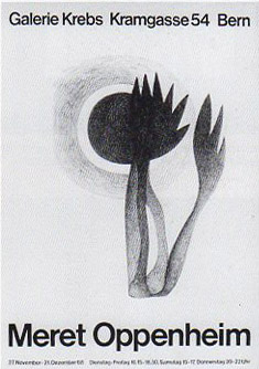
Exhibition poster for a show
in Berne, 1968
In reality, Oppenheim continued to create work, both sculptural and two-dimensional.  She returned to Switzerland in 1937 and worked for years to shake off the gigantic reputation of Object.  She created the piece when she was only 24, and grew to resent the fact that to most people, it represented her entire career.  Oppenheim went on to have a lengthy and respected career that lasted until her death in 1985.  She showed her work mostly in Europe (predominantly Switzerland, France, and Germany) but had a few exhibitions in the United States as well.  In addition to her sculptures and paintings, she also experimented with fashion design and public art.  She was much loved in her adopted country of Switzerland and in 1975 was awarded the Art Award of the city of Basel.

Finding reproductions of her work is a little difficult.  There are some images available online (although the majority of images available are various reproductions of Object).  My local library had a few books, but unfortunately, most of the photos in both of these books are black and white.  Below are some images of her works that I had never seen before.
Beginning of Spring, 1961

The Cocoon (It's Alive), 1971

Greyish Blue Cloud, 1980

Three Murderers in the Woods, 1936

I close with an image of this fountain designed by Oppenheim for the city of Berne, Switzerland.  It consists of a tower surrounded by water pipes.  Moss and small plants grow on the pipes, and the appearance of the fountain changes according to the season.  This piece was constructed in 1983, shortly before Oppenheim's death.  It is still there today, a lasting legacy to an artist who deserves to be remembered for more than one work of art.


Next week, I'll cover a different forgotten artist.  It might be someone you've never heard of before. 

Thursday, May 9, 2013

The Forgotten Artist File: An Introduction


     Art history doesn’t proceed in a straight line.  You wouldn’t know this from looking at an art history book, though.  Every historical survey tells basically the same story, a grand tale of important artists and artistic movements that have become the canon of art history.  This history continues to evolve on a daily basis, and every year sees more artists create art, and every decade produces important artists worthy of inclusion in official art history narratives.  As time passes, authors seem to compress more and more art history into the same number of pages.  Historians can’t include everything.  If they tried that, art history textbooks would be unwieldy tomes thousands of pages long, and nobody would attempt to read them.  Historians instead have to come to a consensus on what the most important art movements were, and whose work is reproduced and recorded.  Masters like Rembrandt and Picasso will most likely always be included in art history books, and art movements like impressionism and surrealism continue to inspire new generations of artists.  Art historians are forced to create an “official narrative” of sorts, deciding what is generally believed and accepted to be the most important timeline.  It’s inevitable that things get left out of this official narrative.  As time passes and art history grows, historians get fewer and fewer pages to devote to an important period or artist.  Many artists get left out entirely.  These artists run the risk of becoming cultural ghosts.  Their works are relegated to dark museum storerooms (museums often promote an official timeline as well), and their stories are only told through old books and journal articles that might not get seen by anymore.
Like Lisa Simpson, I get excited by periodicals.
     But, art is never as cut and dried (or as logical and orderly) as might be depicted in a book.  Important art movements rarely have easy start and end dates.  They overlap and compete with each other for dominance.  Differing movements contradict each other or build off movements of the past.  A movement may be incredibly important only to eventually lose its hold on history.  Conversely, an underground movement or individual artist may be barely reported in their day but later go on to make a comeback years later.  Artists may have incredibly bright, successful careers only to fizzle out and be forgotten a few years later.  There’s so much more to art history than what you might read in an art history textbook, but unfortunately that information often get buried in old books and magazines.  The Internet is where most of us get our information from these days, but reliable chronologies can be even harder to track down there.  Another thing that often gets lost on the web is context.  It can be hard to get a sense of the society an artist lived and worked in from only looking at pictures on a screen.

     Old art journals and magazines are amazing repositories of art history, but I fear this reference is underutilized by art history students today.  When I was in college, the internet (at least the internet as we know it today) was in its infancy and hardly a useful research tool.  If I wanted to research art (or any subject for that matter), I had to go to the library.  The old issues of Art in America and Artforum kept in the Alfred University library was where I received a large portion of my art history education.  Pouring over these old volumes between classes I was able to see art history in the making.  In these pages, the official timeline had not yet been written.  Artists who would go on to become world famous held their first solo shows in small galleries.  Artists who were once considered masters (but may now be forgotten) had their work interpreted by important critics.  Galleries and museums, now long closed, advertised upcoming shows.  Holding those old magazines, I was holding the exact publications that previous generations of artists had read and been influenced by.  To read them is to make a physical connection to art of the past, and art history in general.  It was (and still is) so much more personable then researching articles online.  Looking at old journal articles puts you in contact with the culture of the time period.  Everything about them, from the advertisements to the layout styles to the font choices puts you in the head of artists and graphic designers of past generations.  In short, old journals (art or otherwise) are a record of human communication.  Reading cold, unadorned text on a computer screen just doesn’t have the same effect.

     There have been many artists throughout history who have been unfortunately forgotten or marginalized.  Many times the internet presence of these artists is small or nonexistent.  It doesn’t mean we can’t learn anything from them or be inspired by their work, though.  Over the next few weeks I plan on rediscovering some of these artists and presenting some of their work here, letting these cultural ghosts see the light of day once more.

Next week, the first entry in the forgotten artist file.  It might be someone you’ve never heard of.