Showing posts with label Lost Things. Show all posts

Thursday, September 4, 2014

Modernist Playgrounds of my Youth, Part 2

In my previous post (it’s been a while, I know) I started discussing the design of playground equipment of the past.  Specifically, I was thinking about the large concrete turtle that was a fixture in many playgrounds across the U.S. throughout the 50s, 60s, and 70s.  Manufactured by a company called Creative Playthings, the turtle was just one of several playground elements I remember from my childhood.  All of these things, I discovered while researching this article, were made by the same company.

The playground I specifically reference here was the Hilery Park playground in South Buffalo, New York, but I suspect there were dozens, if not hundreds, of playgrounds across the country stocked with Creative Playthings items.  Since they were all made of concrete (seen as unsafe nowadays) many of these amazing mid-century designs have been torn down and replaced with presumably safer (but definitely blander) playground equipment.  Finding evidence of its existence is hard, and that’s probably most evident with the playground construction known as the Fantastic Village.

Before delving into the Fantastic Village, however, a short history of Creative Playthings will help to establish their artistic pedigree.  It was a company invested in art and design as much as childhood development.  (I must start by giving credit where credit is due.  Much of the info I was able to find on the company came from the article entitled “Creative Playthings: Educational Toys and Postwar American Culture” by Amy F. Ogata.  Read the original here).  The company was started by Frank and Theresa Caplan.  Frank Caplan was an educator who truly believed that toys could stimulate childhood development and imagination.  Creative Playthings creations were intentionally stark and non-specific.  This helped spark creativity in a child’s developing mind.  One of the company’s first mass-produced products were a set of simple hollow wooden blocks.  These could be stacked and arranged any way the child chose.  They were fort, dollhouse, and bookcase all in one.  Really, they could be anything the child wanted them to be.  They also epitomized the simple and elegant designs of the company.  Just maple boxes open on one end, they were simple constructions that could become complex in the mind of the child playing with them. 

Virginia Dortch Dorazio
Caplan later started working with Victor D’Amico, who was in charge of educational programming at the Museum of Modern Art.  This partnership eventually led to the creation of the Fantastic Village.  In 1953, Creative Playthings, MoMA, and Parent’s Magazine co-sponsored a competition to find designs that met the company’s standards of inventive design paired with childhood stimulation and exercise.  The winner was a 28 year old painter named Virginia Dortch Dorazio (sometimes written D’Orazio).  Her design consisted of concrete-walled rooms punctuated with holes of varying sizes that could be used as windows, doorways, or climbing grips.  The structures were held together with metal bars that could also be used for climbing.  This was the Fantastic Village.  After winning the competition, Dorazio’s design was put into full production by Creative Playthings and featured in their catalogue.  Below are some photos I was able to find of the design.


What’s interesting looking at these photos is that the configuration of the rooms is different in every photo.  Like Caplan’s maple boxes that could be arranged in many different combinations, it seems that the Fantastic Village had no set plan or scheme for the pieces.  I was unable to discover whether Creative Playthings sent multiple installation ideas with the set, or whether it was up to the purchaser to set it up how they chose.  Regardless, it perfectly fit the company’s ideas on open-ended play.  The Fantastic Village could be a playhouse, fortress, or castle.  Unfortunately, I was only able to find black and white photos of the piece, and the Fantastic Village was definitely colored.  I remember the concrete was yellow, blue, red, and green.  Also unfortunate was that all of the photos I could find seem to be promotional photos sent out by the company to promote the product.  I couldn’t find any pictures of a Fantastic Village in situ.  I was certainly not able to find any contemporary photos of one.  I have no idea of how many were sold.  That’s sad because it leads me to believe that every one of the Fantastic Villages sold in the 50s and 60s has by now been torn down.   It’s possible that they now exist only in the memories of children (now adults) who played on them many years ago. 

Of course, when I was a child I had no idea I was playing on a piece of cutting edge mid-century modern design endorsed by one of the most famous museums in the world.  I didn’t know the name “Fantastic Village” either.  We called it the “Swiss Cheese”.  Design concerns and child psychology and development didn’t interest us.  It was just fun.  Perhaps it also helped me become a more creative person.  As is turn out, I was being influenced by artists even before I truly know what art was. 

Next time, a new topic.  It may be something you've never heard of.

Thursday, July 3, 2014

Modernist Playgrounds of My Youth, Part 1

As the upcoming holiday weekend approaches and the weather gets hot, I’m spending more time outside.  Now I’m mostly working around my house, but when I was younger the warmer summer months meant playing outside.  Playgrounds and play areas for kids are different from when I was growing up in the late 70s and early 80s, and I wanted to take some time to examine those differences by investigating one of the playgrounds I frequented as a child.  My research into the topic yielded more information than I expected, and I realized that as a child I was playing on important modernist designs (now lost, in more ways than one).

I’ll begin with a short explanation of how I got to this topic in the first place.   I started by trying to remember details of a playground I went to as a child.  The Hilery Park Playground in South Buffalo is not one of Buffalo’s most well-known parks (Frederick Law Olmstead’s much more respected Cazenovia Park is just a few blocks away).  It’s really just a glorified school playground, attached to the Hilery Park Academy (known as Public School 27 when I was a kid).  Thinking back, it really epitomizes the differences in children’s play spaces then and now.  Today safety is rightly a major concern.  Playgrounds are built on grass or mulch, and plastic is used for much of the construction.  The Hilery Park playground in the 70s was very different.  All of the play sculptures there were concrete, and everything was built over asphalt.  There weren’t many trees for shade.  This may seem strange to parents today, but I never felt at risk there.  Even though everything was made of rough concrete that got constantly blasted by the sun, I have only good memories of the place.  The hardness of the playground must not have concerned my mother much either, since she took me and my siblings there all the time.  I think safety concerns have trumped originality as of late, and all playgrounds today really look the same.  Spiral slides, a rock climbing wall, maybe some elevated walkways and passages are the norm.  Hilery Park stood out to me (even as a child) because it was different and special.  My research revealed to my how special it once was.

Sadly, the turtle I played on as a child was not built over sand.

What really started me down this path was researching one of the playground’s features.  I remembered that there were large concrete turtles that once stood there.  These turtles (there were two of them I think) could be climbed on or crawled under.  Doing a little digging on-line revealed that these turtles were popular across the country, and many are still left.  Those that are still in existence have at times been the focus of preservation efforts, so I’m not the only one who fondly remembers these rounded green beasts.  I won’t go into their history too much here, since they are much loved and there are several websites that track their history and locations throughout the US (including this map, which documents many existing and lost turtles.  It’s incomplete, though- Hilery Park isn’t on the list). 

Page from 1956 catalog
I soon discovered that the turtles were designed and produced by a company called Creative Playthings, and they first appeared in the 1950s.  The website Mondo Blogo posted an entire catalog of the company’s products (view it here) dating from 1956.  The turtle play sculpture is featured prominently in the section on play sculptures, indicating that it was popular even then, while it was still in production.  As I scrolled through the pages of the catalog, I noticed not only the turtles, but other features of the Hilery Park playground were apparently sold by Creative Playthings as well.  Triangular ramps that I remember running on as a child were featured, as was a large fort-like construction called The Fantastic Village.   These were a part of my childhood memories as well, and I wasn’t expecting to find them.  (more on those play sculptures in my next post).

Reading through the catalog, I realized one of the things that truly makes writing this blog enjoyable.  It’s really a form on time travel.  Seeing all these play sculptures in the same catalog, and knowing that they once all graced the same playground, puts this catalog in the hands of a Buffalo city planner over 50 years ago.  I can start to understand the decisions that were made that would impact generations of children in South Buffalo.  The catalog I found record of was from 1956 (according to the poster) and I am guessing that the Hilery Park playground must have been supplied with the Creative Plaything products at or around that date.  I played on them as a child in the late 70s and early 80s, so for at least 30 years these objects were a part of the neighborhood’s fabric.  Will the generic metal and plastic playgrounds of today hold up for another 30 years?  Possibly, but they certainly won’t be remembered for their unique designs.

For my next post, I’ll explore the Fantastic Village; kid tested, MoMA approved.

Friday, May 3, 2013

Schadenfreude on Display: The Huntington Hartford Gallery of Modern Art, Part 4


Postscript


     Over the past few weeks, I’ve been documenting the rise and fall of Huntington Hartford’s Gallery of Modern Art.  Over forty years after its closure, it’s hard to put ourselves in the shoes of those who thought the Gallery could succeed and thrive in the competitive New York art scene.  To run the GoMA, Hartford chose Carl J. Weinhardt as curator.  Weinhardt was initially reluctant to run the Gallery (Hartford’s iconoclastic views on abstract art were well known at the time) but was eventually won over and hoped the museum could rise above its associations with a man whose artistic philosophy was widely derided by established critics. In the March 21st, 1961 issue of the New Yorker, Weinhardt stated:


            “What I really want for the Museum is to be pro, not anti. I feel we should show things because we are for them, and not simply because we are against what we’re not showing” and hoped that “the Gallery may stimulate new trends in this direction, in addition to throwing light on what already exists and is being neglected by other museums.”

      It wasn’t to be.  The lackluster collection, partnered with Hartford’s anti-abstraction stance, doomed the museum.   His beliefs were almost comically outdated at a time when abstraction and non-objective art were commonly accepted and collected by museums and institutions across the county.  After World War II, non-objective art had helped put America on the map as a serious player in the art world, and one could argue that the art infrastructure that grew in New York after the war was built squarely on the shoulders of abstraction (especially the work of the Abstract Expressionists).  Simply put, abstraction was firmly established as a valid art form by the 1960s. By ignoring it Hartford was ignoring a large swath of art history, one widely acknowledged as being an important (if not the most important) contribution to art histroy of the twentieth century. 

      There were certainly those who were distrustful of abstract and non-objective art back then, as there are today.  Perhaps we look at such works and ask ourselves “why is this art?”  There are those who believe that these artists were con men, pawning nonsense off on an unsuspecting public, but this couldn't be farther from the truth.  The Abstract Expressionists were trying new things and experimenting with new forms.  Unsatisfied with the status quo, they challenged the system and created works that still cause us to ask questions, and don't offer up easy answers.  The fact that a Jackson Pollock painting made sixty years ago can still engender fierce debate speaks to the power art has to engage our mind, as well of question our basic expectation of what art can be.


     Abstract art isn’t always easy to read or appreciate, mainly because it’s so open to interpretation.   We may not understand abstract art when we first look at.  Maybe we find it downright confounding.  I think the main obstacle people face when interpreting abstract art is coming to a work with the belief that it has one set interpretation that we can’t see.  We may look at it and say “what’s this about?”, thinking the artist intended a single meaning that everyone has to see.  If we can’t see it, then we’re just not getting it.  What we often don’t realize is that the meaning is whatever we make it.  We have the power to make the work about anything we want, which in turn makes the work relevant to us.   It can evoke deep emotions, or we may like the colors that the artist used.   Perhaps it doesn't move us at all, and that's a valid response, too.  Abstract art can mean a thousand different things to a thousand different people.  It offers such a wide range of personal interpretations that the works can remain relevant for extremely long periods of time.  Realistic art can occupy this role in our lives too, of course, but Hartford wasn’t willing to acknowledge the fact that abstract art can move us just as much as a realistic image.   Instead, he played into the old misconception that abstract art was reserved for the elite, and could only be understood by art historians.  He thought he was giving the public what they wanted, but in the end he sold us all short.  The human mind has an amazing capacity to find meaning in the abstract.  It can help us learn more about our own minds, as well as the world around us.  Hartford refused to recognize this, and in turn created a reverse ivory tower, an isolated island (both literally and figuratively) on Columbus Circle that was seen as irrelevant before it even opened its doors.

Next week, I start a new topic.  It might be something you've never heard of before. 

Thursday, April 25, 2013

Schadenfreude on Display: The Huntington Hartford Gallery of Modern Art, Part 3


In my previous post, I wrote about Huntington Hartford’s iconoclastic views on art and his art collection.  As he planned a museum to showcase the art he favored, he needed a building in Manhattan.  Once built, the museum building received a mixed reaction from critics, just like the art that was on display inside.


The Site


     Hartford faced a daunting task when deciding to place his new museum in New York City.  New York has dozens of art institutions and galleries, so making an impression (both then and now) is difficult.  Hartford chose a prominent location for the museum, and it was a location that would certainly get noticed.  But, the lot he chose posed some very specific problems. 


The building that sat at Columbus Circle in the 1950s.
     Columbus Circle sits at the southwestern corner of Central Park.  Serving as the intersection of Central Park West and Broadway, it’s about as high-profile a location you can get in Manhattan.  The plot of land at 2 Columbus Circle is where Hartford decided to build.  It’s a small, trapezoid-shaped bit of land surrounded by busy streets.  In another, less populous city it might have just remained undeveloped green space at the edge of a traffic circle.  But, in space-starved Manhattan, something was built there.  A structure housing "a shoe store and offices" (according to Hanford Yang's proposal- see below) sat on the property when Hartford bought it in the late 1950s.  To any architect, the plot would be difficult to build on.  It was small (only 5,000 square feet- miniscule by New York standards) and oddly shaped.  Each side of the property was a different length, and the longest side was only about 100 feet.  Any architect that Hartford chose would have to deal with these limitations while still providing ample space inside to show the artwork sufficiently.  Hartford eventually chose Edward Durell Stone as the architect of the building, an experienced builder who approached the site and the museum in some pretty interesting ways.


Choosing an Architect


Hanford Yang's design
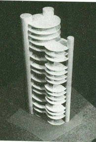
     When searching for a designer for the future Gallery of Modern Art, Hartford was initially drawn to the design submitted by a recent MIT graduate named Hanford Yang.  Yang, who was Chinese, proposed an innovative design (it was actually his Master’s thesis) that used three tall tubes, placed at the edges of the property, to house the mechanicals and stairs.  This left the interior spaces open.  In Yang’s design, the exhibition floors were hung from the three tubes and sheathed in plastic panels that acted as walls.  While researching this topic, I was surprised to find Yang’s entire original proposal from 1957 posted on the Internet.  It’s a fascinating relic from the past, documenting his unrealized concept as well as giving a contemporary account of 2 Columbus Circle before the museum was built.  But, Yang was not registered as an architect in New York State, so his design could not be used.  Hartford eventually brought in Edward Durell Stone as architect, an American designer with extensive experience in museums and public buildings.

Stone's American Embassy in New Delhi, India
     Stone was no stranger to museum design.  He had designed an expansion at the nearby Museum of Modern Art, and was at the time receiving international attention for his designs of the US Embassy in New Delhi, and the US Pavilion at Expo ’58 in Brussels.  He also designed such notable buildings as Radio City Music Hall and the Kennedy Center in Washington DC (I discovered while writing this that he also designed the Buffalo News Headquarters.  I drive by this building almost daily and never realized Stone was the architect.  You truly do learn something new every day!).  At the time, Stone’s buildings were characterized by delicate, perforated screens that covered a building’s entire façade, making it seem light and airy.  These screens became a sort of trademark for Stone, and would prove difficult to integrate into the final Gallery of Modern Art plan.


The Building


     Stone faced many challenges while designing the GoMA.  Art needs wall space, but interior spaces also need light.  Bringing large amounts of natural light into the museum wasn’t really an option, since windows take up wall space.  Therefore, most of the light in the GoMA had to be provided artificially.   The windows were small, porthole-shaped openings that were pushed to the edges of the structure, allowing only limited natural light to reach the interior.  From the outside, they were covered by Stone’s trademark perforations.
The GoMA's interior.  The small porthole windows can be seen in the background.
      Inside, Stone handled the space restrictions quite elegantly.  The museum was constructed with nine floors, but only four floors showcased the art.  When planning the exhibition spaces, Stone had to contend with such things as mechanicals, elevator shafts, and stairways.  These essential elements can’t be removed from any structure, so Stone had to figure out a way to work around them.  The size of the stairs between the exhibition floors was expanded, creating large stair landings.  These landings also served as gallery space, greatly increasing the amount of wall space available.  The wall spaces were decorated with exotic hardwoods and the floors were carpeted.  A far cry from the stark white walls popular at the Museum of Modern Art.  The effect was more like being in someone’s living room instead of a sterile museum.  A pipe organ provided live music for patrons as they strolled through the galleries.  The remaining floors housed offices, a small café, and Hartford’s lavish Polynesian restaurant, named the “Gauguin Room”.


An early rendering of the GoMA
    The outside of the building proved more challenging.  Stone’s perforated screens covering the windows were pushed to the corners of the structure, leaving most of the façade a stark, unadorned marble slab.  One critic compared it to a “punched railway ticket”.  It created an imposing, unfriendly edifice facing one of Manhattan’s busiest intersections.


     But at ground level, one could find what were perhaps the buildings most characteristic features (for better or for worse).  Stone designed the museum as sort of a stretched-out Venetian palazzo, supported by columns with round windows above them.  Critics were quick to compare the shape to lollypops, and the building was unofficially called the “Lollypop Building” for decades afterwards.  The features of the building were either wildly ahead of their time or just plain comical.  The building has been described as slyly referencing other architectural styles; a precursor to what later became known as Post-Modern Architecture.  To others, it just looked silly.  A white elephant stranded at the edge of the traffic circle.  Critics were divided as to whether Stone had created a modern masterpiece, or was signaling that his best work was now truly behind him.


The lollypops are clearly visible here
  Had the museum survived, it would have caused more headaches for later directors or curators.  Expansion at the Columbus Circle site would have been impossible, since the museum was totally landlocked.  Contemporary museum amenities like a bookstore or expanded café would have been difficult to place in the cramped quarters.  Hartford did initially have plans to build a freestanding restaurant/café across the circle at the corner or Central Park, but New Yorkers didn’t want a privately owned restaurant operating in a public park.  Protests first delayed, then eventually prevented, construction.


Legacy and Renovation


The Museum of Arts and Design
     Hartford spent a considerable amount of his own money to construct Stone’s design.  The building, which had been budgeted at about 3 million dollars, ended up costing over twice that.  The Gallery was open for about five years, and Hartford failed to recoup his investment.  The lukewarm reception of both the art and the building that housed it hastened its closure.  By July of 1969, the GoMA was finished.  The museum had failed to make an impression on the New York art world and Hartford transferred ownership to Fairleigh Dickinson University, who operated the site as the New York Cultural Center.  The building survived long after the Gallery of Modern Art was dead and buried, and slowly became a part of the fabric of New York City.  Manhattan residents remained divided as to its legacy, though, and several efforts to get the building landmark status failed.  In 2008, The Museum of Arts and Design (formerly the American Craft Museum) moved into the building and radically changed both the interior and exterior.  This touched off numerous battles between preservationists and architecture scholars who wanted to save the building as Stone designed it, and developers and planners who wanted something done with the structure regardless of what it looked like  (it had been unoccupied for many years at that point).  I won’t re-hash the arguments here, but a good version of the events can be read here.


     Architect Brad Cloepfil was hired to adapt the building for the 21st century.  The marble cladding was removed from the entire structure and replaced with windows and ceramic panels.  The interior was redesigned as well.  The lollypop columns at ground level were kept, though now they are sheathed by glass panels.  


     Both the art collection and the museum are gone now, relegated to the category of Cultural Ghosts.  Photographic evidence is all we have left to remember them by.  Stone’s building design, which stood for decades, appears in photos and films (people do occasionally make movies in New York).  Huntington Hartford didn’t make out so well.  He died mostly forgotten, his art collection long dispersed.  The museum building held up much better, now silently joining the ranks of such lost buildings as the venerated Penn Station.  It is gone, but not entirely forgotten. 
Stay Puft Marshmallow Man included to show scale.


Next week, some concluding thoughts as I wrap up another topic.